Milano Partecipa
Introduction
What is it?
Milano Partecipa is an initiative promoted by the Municipality of Milan. It is an online platform that allows Milanese citizens to actively participate in the democratic life of the city, expressing opinions, proposing ideas and collaborating with the municipal administration to improve the quality of services and the urban environment.

Through Milano Partecipa, citizens can participate in public consultations on issues of collective interest, propose projects or report problems in the Milan area. The platform also offers a space for dialogue and comparison between citizens, promoting active participation and collaboration between different realities and associations in the city.

The goal of Milano Partecipa is to foster participatory democracy, involving citizens in co-planning public policies and identifying priorities for urban development. The municipal administration seeks to make the city's governance more inclusive, transparent and accountable through this tool.

Milano Partecipa is an example of how digital technologies can be used to actively involve citizens in the management of public issues actively, promoting a culture of civic participation and collective responsibility.
The Goal
The Process
Proposed New Features
Service Map
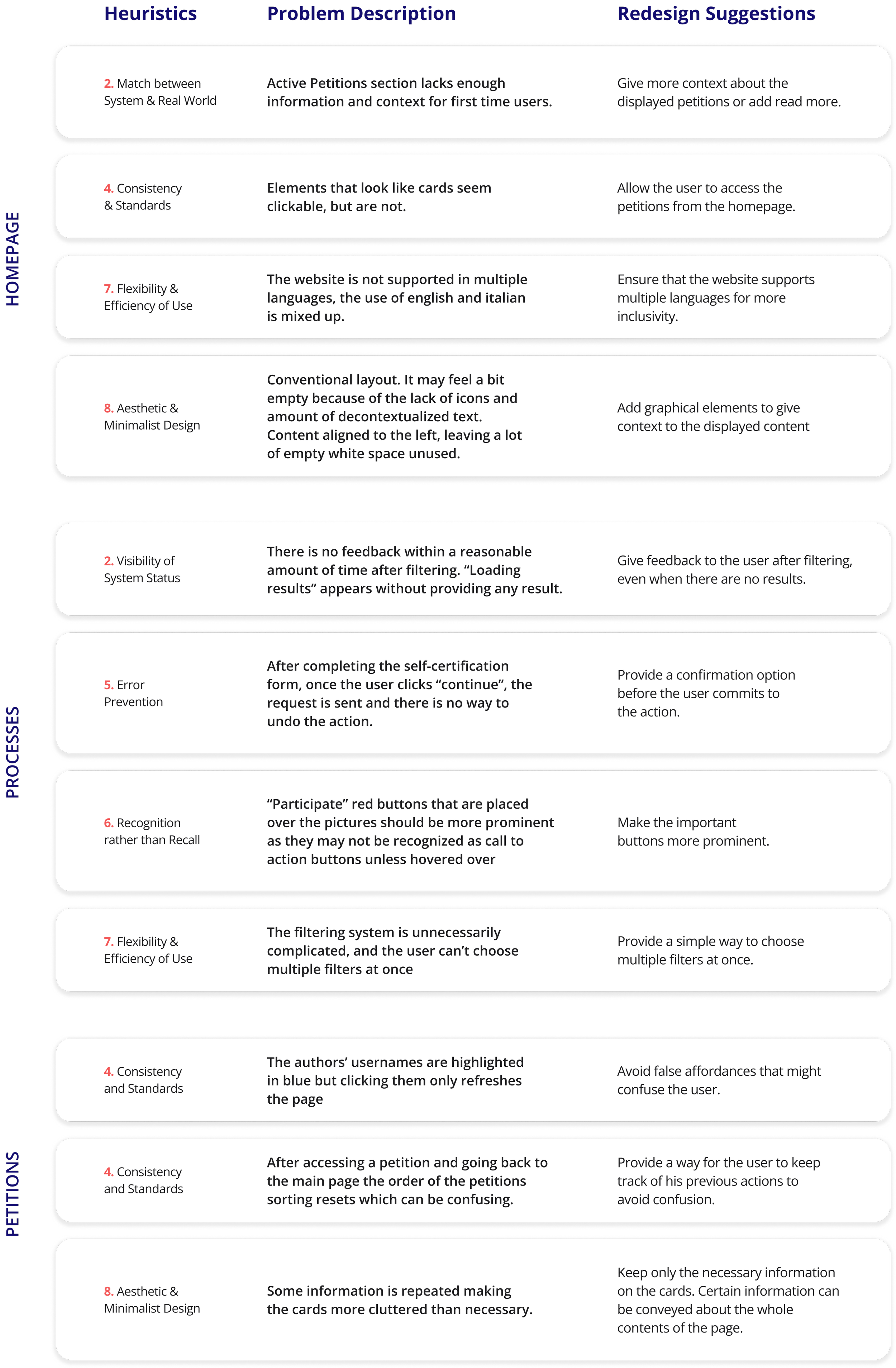
Heuristics Analysis
Problems and SuggestionsIn-depth Interview
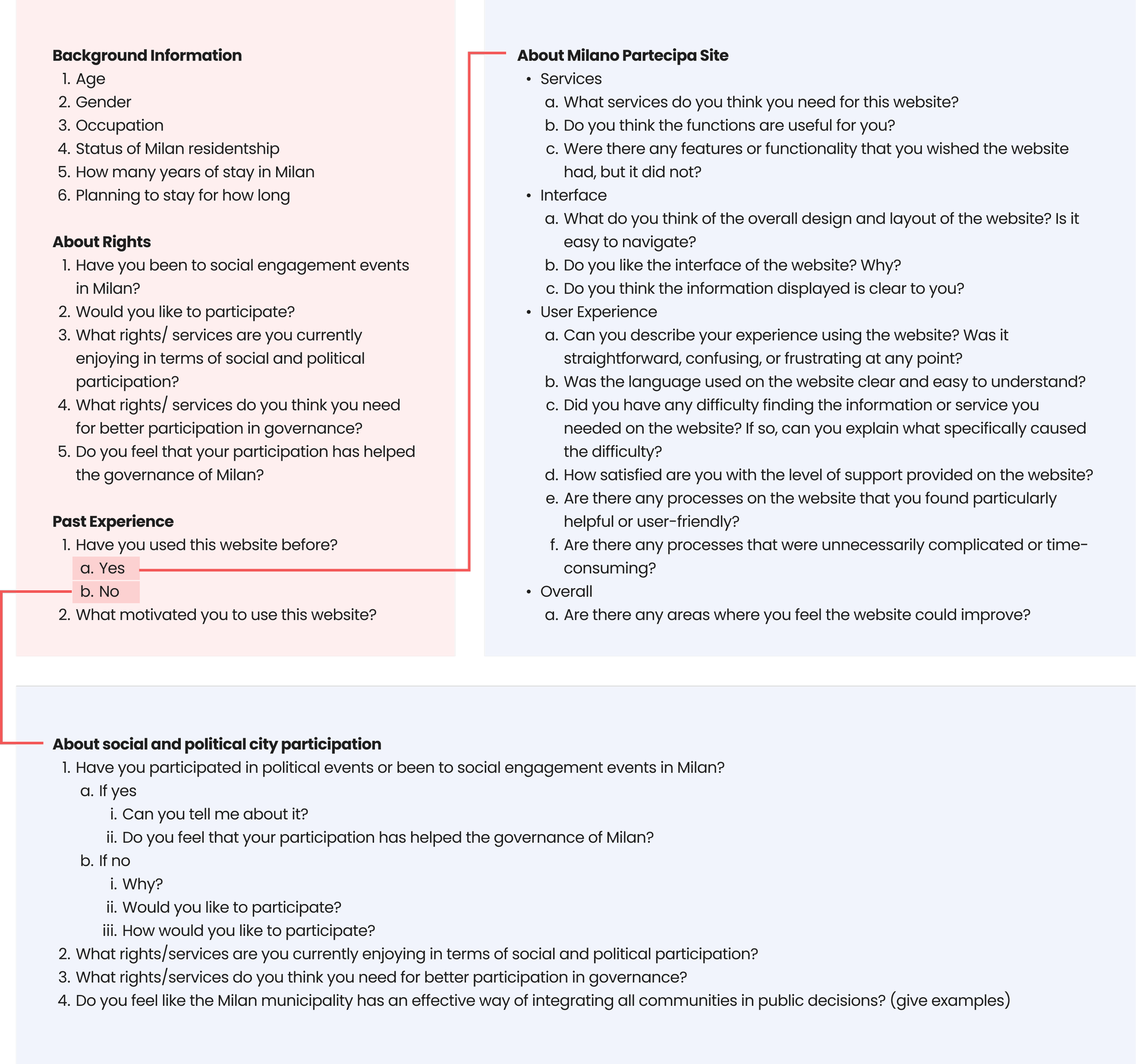
Interview GuideTo gain a deeper understanding towards immigrants, we conducted some in-depth interviews with them, and an interview guide was created to aid the interview process.
After acquiring their basic information and thoughts about their rights as an immigrant in Milan, we started to move forward to the topic of the Milano Partecipa site. As they might or might not have experience using the site, we have separated two sets of questions based on whether they have used the website before.Design System
Colour SelectionWe came up with a new color scheme to enhance the visual appeal of the platform, consisting of blue as the primary color and red as the accent color.
The selection of blue is because of its association with calmness, reliability, and professionalism. It can create a more soothing and inviting user experience, making participants feel comfortable and engaged on the platform. At the same time, it establishes a positive emotional connection between users and the platform and enhances user trust and engagement.
We kept red as an accent colour to create a visual hierarchy and draw attention to important elements or calls to action on the platform. Using a less saturated red retains some of the original color's vibrancy while ensuring it does not overpower or distract from the primary blue color.Typeface SelectionWe used Open Sans to ensure that the platform's content is easily readable for users, enhancing their overall experience.
The balanced letterforms and generous spacing between characters make it highly readable, even at smaller sizes. It is a versatile font that works well across various platforms and devices. Its clean and contemporary design makes it suitable for both web and mobile interfaces.
It scales smoothly and maintains clarity, ensuring consistent legibility and visual appeal across different screen sizes and resolutions.UI ElementsUse of CardsWe used cards to represent the content of the different sections of our platforms.
Cards allow the effective organisation of information by breaking it into digestible and visually distinct chunks. They offer a clear visual hierarchy, prominently displaying important or featured content. This helps users quickly scan and process information, making finding what they are looking for and navigating on the platform more accessible.
They are inherently flexible and responsive, adapting well to different screen sizes and orientations. This responsive nature ensures a consistent and user-friendly experience across various devices, including desktops and mobile phones.First Touchpoint: Mobile App
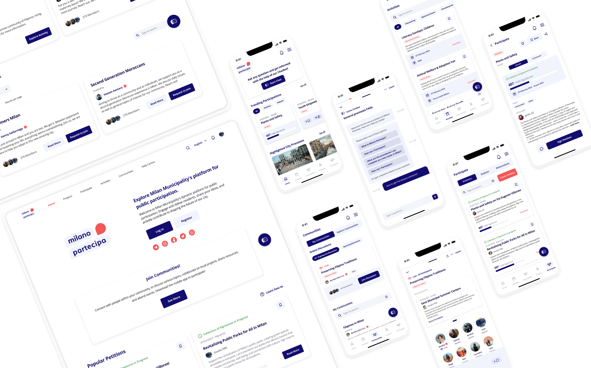
HomepageThe homepage fulfils multiple vital purposes as the gateway to the app's functionalities. Firstly, it offers users a snapshot of the city's current events, initiatives, and opportunities for involvement, fostering a sense of community and keeping citizens informed.
Additionally, we wanted the home page to be a central hub for users to explore and discover new ways to participate actively in their city's development.
Moreover, the user can access secondary pages through the tab bar to shorten navigation times.ChatbotAfter performing several tests asking the users to access the ChatBot and the main features, we recognized the need to give shortcuts through the homepage.
Therefore, we decided to make the ChatBot a floating button for every screen except for the homepage. When accessed, the chat appears as an overlay that can be minimized and accessed again, through another shortcut.ActivitiesThe “Activities” section was designed to allow users to discover a wide range of activities in Milano Partecipa, curated and promoted by the Municipality.
In this section, users can engage with educational, cultural, and sponsored events, fostering meaningful connections and active participation. The section focuses on delivering critical information while allowing the chance to quickly save and share the content. CommunitiesAs a crucial component of our concept, the “Communities” section invites users to join an offer of diverse communities tailored to their specific needs and interests.
By participating in these communities, individuals can cultivate a sense of belonging and strengthen their connection with Milano.ParticipateThe "Participate" section provides users access to petitions, debates, and referendums, empowering them to exercise their rights to participate in civic affairs.
The users can engage in meaningful discussions, voice their opinions, and actively contribute to shaping the future of the Municipality of Milan.Second Touchpoint: Website
Similar to the app’s version, the “Homepage” serves as a central hub for users to explore various functionalities and services of Milano Partecipa, including “Popular Petitions”, “Highlighted City Processes”, “Ongoing Debates”, “Upcoming Activities” and “Latest Public Budgets”.

The page starts with a welcoming message to inform users briefly of the platforms' nature, allow them to log in or register to the site, and display the available social media channels for communications and connections.HomepageProjectsFollowing the IA, we placed Public Budgets at same level of the City Processes, so the user can access both directly. For the inner pages, we kept the original structure where user finds an overview and a side panel with key information. ParticipateThe Participate section was restructured from the original website to include Petitions, Debates and Referendums in the same section, simplifying the navigation. The inner pages were designed to be consistent with the Project section. ActivitiesThe Activities section was added as one os the first-level sections, to prioritize access to this new feature. When clicked, the user finds the activities offer, able to filter by area and type of activity. The inner page was designed in accordance to other sections, with the main CTA intended for booking. CommunitiesThe Communities section was also included as a first-level option in the menu, to highlight the importance of this new feature for our concept. As mentioned before, the user can access all the communities information through the website, but is prompted to download the app to unlock all the live features available under this section. The structure of this feature was divided between My Communities and Explore Communities, to give priority to the communities the user is already part of. Inner pages design correspond to other sections’ pages, highlighting here the activity tab where the user can check future events and online discussions scheduled. Personal AccountThe Personal Account section grouped all the data related to the user, including its activity and the saved items, different from the app structure. Since the website layout allows the user to visualize more content per section, this was useful for including all user-related information under one section. Conclusion
In conclusion, the Milano Partecipa concept has undergone extensive concept development, testing, and iterations, leading to the following key points. We aim to create an inclusive platform that validates user experience, prioritises community engagement, and continuously enhances the user journey. By connecting and empowering citizens, we aim to reflect the values and aspirations of the Municipality through ongoing development and improvements.

While our primary objective was to create an inclusive platform that targets minorities and underrepresented communities within the Municipality, it is important to note that the solution is designed for every user falling under the "Citizen" and "City Users" categories defined by the Municipality.

We conducted rigorous testing and iterative improvements throughout the development process to validate the Information Architecture and user interface. The results of our testing sessions indicate that most users successfully completed tasks, with minor areas for improvement that can be addressed in future iterations.

A significant focus of our concept was the development of new features that foster community-building and trust among citizens. The Activities and Communities sections have emerged as important components we intend to develop further and enhance.


